Example package
Marketing page from Figma
One marketing or landing page built to match the design.
You get
- Page matching desktop, tablet and phone
- Editable content where the platform allows
- Accessibility and speed checks
- A preview link before launch

We turn finished Figma designs into working, responsive pages: hand-written HTML and CSS, React or Next.js, or built inside Webflow, Shopify, WordPress, Squarespace or Wix so your team can edit them.
Tell us what you needSee typical projectsScoped in writing, built in your accounts, handed over with docs.

What we hear from businesses before a project like this starts.
The requests that come up most often for this kind of work, and what each one takes to work properly.
Production-quality components, matching the design at every breakpoint.
Built in Squarespace, Wix or Webflow as accurately as the builder allows, with the limits explained up front.
Sections and templates built into the theme so the store team can edit them.
Clean, fast pages without a page builder, for a site that has to load quickly.
Sensible mobile layouts derived from the design, shown to you before building.
Hover states, transitions and scroll effects from the prototype, kept light.
Tools that come up most: Figma, HTML, CSS, JavaScript, React, Next.js, Tailwind, Webflow, Shopify, WordPress, Squarespace, Wix.
Concrete pieces, each one something you can open and check when it's done.
Pages that match the design on desktop, tablet and phone.
HTML, CSS, TailwindReusable components built from the design system in Figma.
React, Next.js, TypeScriptThe design built inside Webflow, Shopify, WordPress, Squarespace or Wix with editable content.
Webflow, Shopify sections, WordPress blocksHeadings, contrast, alt text and keyboard navigation done properly.
WCAG checksOptimised images and fonts, and no unnecessary scripts.
LighthouseA component list and notes on how to add new pages.
DocumentationExample packages to show the shape of the work. These are examples, not past clients; yours gets its own written scope.
Example package
One marketing or landing page built to match the design.
You get
Example package
Your Figma components and pages built as React or Next.js code.
You get
Example package
A Figma redesign built into your Shopify theme as editable sections.
You get
Example package
A multi-page design built in Webflow or WordPress for your team to edit.
You get
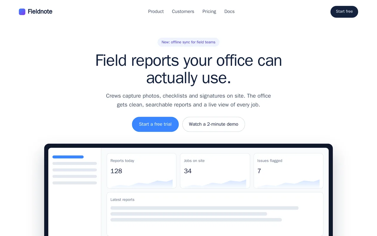
Fieldnote's designer handed over a Figma file for a new marketing site, and the team needed it built pixel-accurate, fast and easy to edit. We turned the design into a responsive site with reusable components, matching the spacing, type scale and breakpoints from the Figma file. It is wired to their CMS so marketing can edit copy and add pages without a developer.
Next.js, React, Tailwind CSS, headless CMS, Vercel
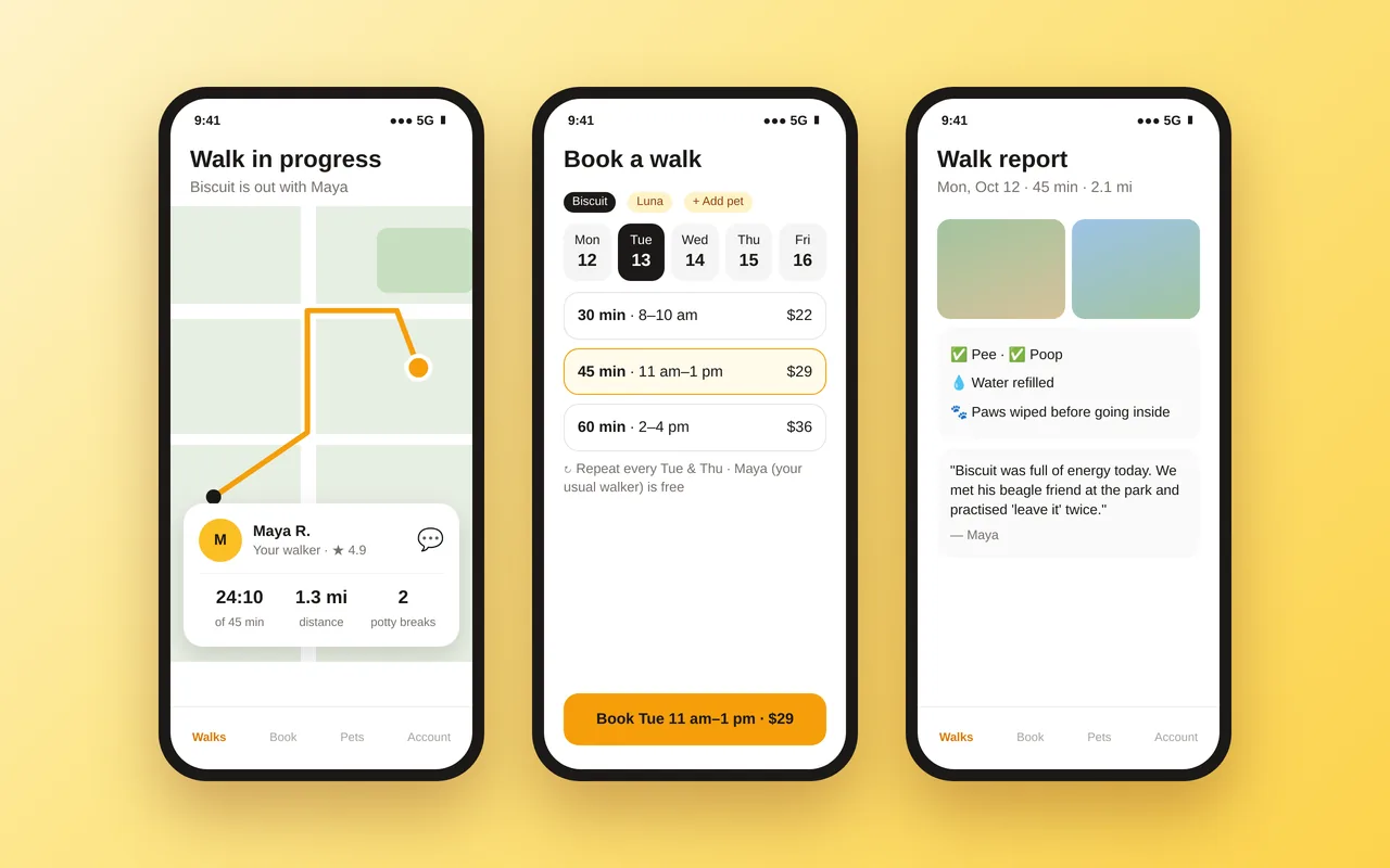
A local dog-walking company was booking walks by text and sending updates as camera-roll photos. We built a client app for iOS and Android, plus a walker app and an admin panel. Owners book walks or recurring schedules with their usual walker, follow the walk live on a map, and get a report afterwards with photos, a checklist and a note from the walker. Payments, tips and cancellations run through the app.
React Native (Expo), TypeScript, Node.js API, PostgreSQL, Stripe, Mapbox, push notifications
A working example we built to show this kind of work. It is a demonstration, not a client project.
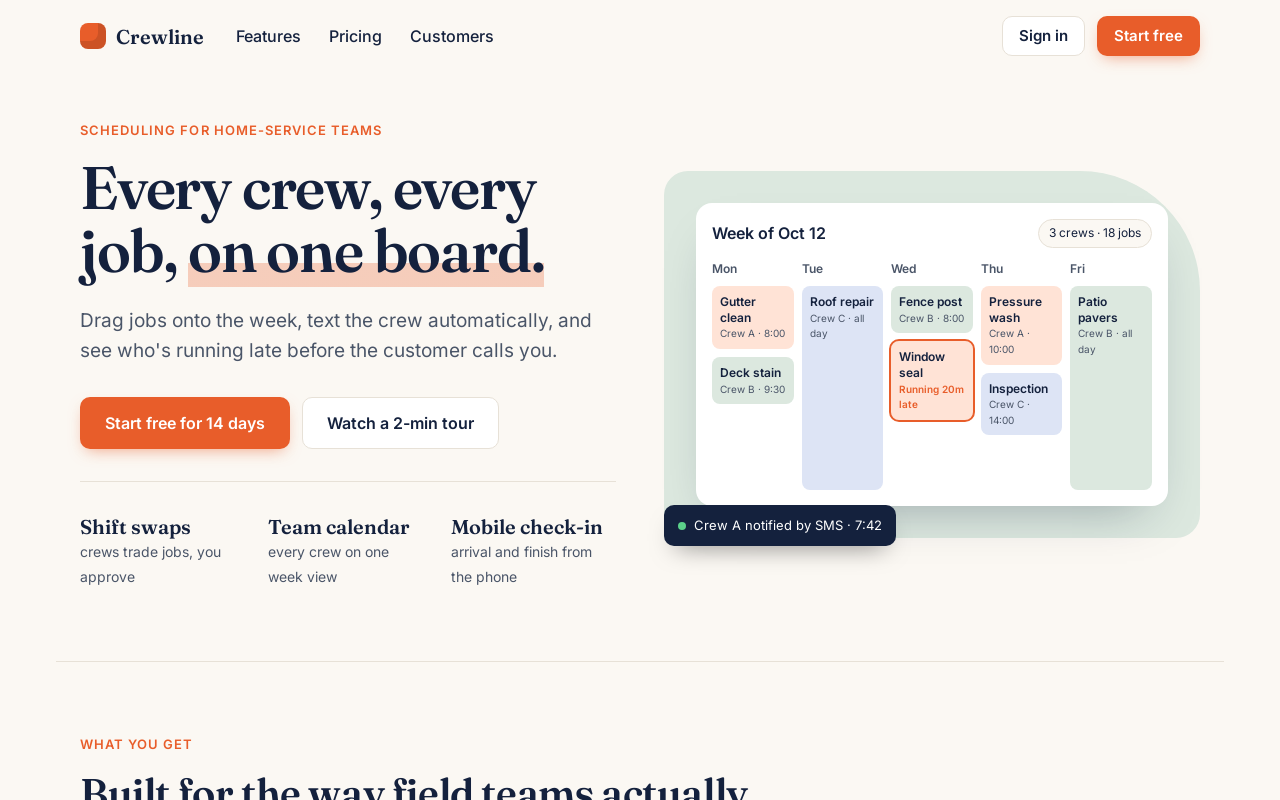
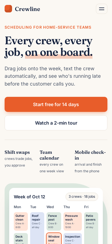
Sample build
A landing-page hero and a six-card features section built from a written design spec with color and type tokens, a spacing scale and three breakpoints. Two columns on desktop, stacked on tablet, single column with a collapsed nav on mobile.
HTML5, CSS (custom properties, grid, media queries), Google Fonts
About the screenshots: Built from a written design spec, shown on desktop and mobile.
The habits that keep this kind of project from going wrong.
We look through the Figma file for missing states, mobile layouts and fonts, and list them in the scope.
Built pages are compared against the design at each breakpoint before you see them.
Clean code you can maintain, not generated output pasted in.
Text and images your team will change are editable without a developer.
You know what you're getting before work begins, and you see it working at every milestone.
Tell us what you need in your own words, and which tools you already use. A few lines is plenty to start.
We reply with a short written scope: what gets built, what is out of scope, which accounts we need, and how we'll both know it works. You know what you're getting before work begins.
The work is split into milestones. At each one you see it working in your own account and sign it off before we go on.
You get the working system, its documentation and a walkthrough. If anything we built breaks in the next 30 days, we fix it at no charge.
Pushbuild has built software for businesses since 2010, for more than 40 clients. Every project is led by a former public-company CTO, from Groton, Massachusetts. See products we've built.
Mostly. Missing mobile layouts or states are fine; we propose them and show you before building.
In code, yes, at the breakpoints designed. In website builders, some details are limited by the builder; we list any differences in the scope.
You do. Code goes into a repository you own, and builder sites are in your account.
Our focus is building designs you already have. Small design gaps, like a mobile layout, we fill in and show you first.
A single page usually takes a few days; a multi-page site one to three weeks from the signed scope.
For 30 days we fix anything we built that does not work as the scope describes, at no charge.
Email a few lines about what you want and which tools you use, or call. We reply with questions or a written scope.
hello@pushbuild.com